


Steam’s been around for years and it’s gone through a few visual changes but the one thing that’s stayed pretty consistent is the wishlist page. People interact with this page quite a lot, especially during seasonal sales, but for some reason Valve has continued to keep this archaic design alive instead of tearing it down and redoing the whole thing. Now the Steam client itself could use with some major overhauling and people out there have put out some very good concepts, but I’ve yet to see someone touch on the wishlist page which is what I’m going to do.
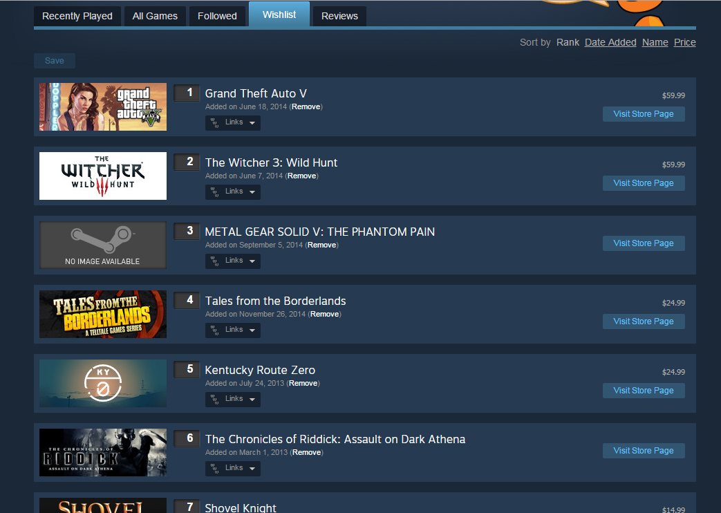
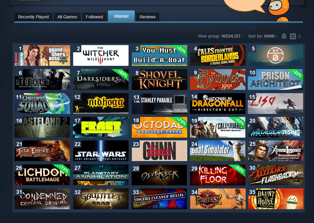
The current old and busted wishlist menu
The absolute first change I’d make isn’t even on the wishlist page. I’d first add in an option on the store page of every game to remove that item from your wishlist straight from their store page. I can’t tell you how many times I’ve messed around on a game’s store page only to decide that I no longer want it on my wishlist and then realized I can’t remove it from there. Instead I have to hop on over to the wishlist page, scroll down until I find the game I want to remove, remove it, and then wait for the page to finish refreshing itself. Being able to add an item to your wishlist from their store page but not remove it by clicking the exact same button is mind-boggling. To me, good design is efficient design and everything about this, and the wishlist page itself, is the exact opposite of good design.
Now onto the wishlist page itself. I have four main issues with how this page is set up and I’m going to spend the bulk of this article addressing how to fix them: items added to the wishlist are never added in order, the page has to refresh every time you remove something, having to hit the save button every time you rearrange something, and your view of the list is far too small and makes arranging items a nightmare for anyone with a decent sized wishlist.
A new grid-based look that offers a cleaner, and more intuitive menu.
For the first complaint, I really have no idea why this happens and I have no way to fix it since it’s such a weird thing Steam does. Most of the time when I add a game to my wishlist it doesn’t go to the bottom of the list like you’d expect it to; it usually shoves itself between two games somewhere in that general vicinity. A few times I’ve even had a game pop up halfway near the top of my wishlist. I’d honestly just like an explanation for this because it makes zero sense. Now the next two items are a complete pain to deal with whenever you spend time managing your wishlist. I really don’t get why the page has to refresh itself every time you remove an item since it makes removing multiple items annoying as hell since you have to sit there waiting for the page to refresh multiple times. Then there’s the fact that you have to hit the save button whenever you rearrange your wishlist. Why can’t it just save itself automatically? These are two incredibly dumb and archaic things that no other place does.
Now my final complaint deals with how limited your view of the wishlist is and brings me to my slight (very rough) redesign of the menu. As you can see from the image on the left, I believe moving towards a more grid-based layout would be a huge improvement over the current view. Not only is scrolling through the wishlist a pain already, but it makes rearranging items a massive chore since you have to move an item, and slowly scroll your way to the spot you might want to place it. A grid-view would not only give you a larger view of your wishlist but it would make rearranging it effortless. Another feature I’d add would be the option to make folders/groups for items in your wishlist. Sometimes I add games to my wishlist because I want to buy them in the immediate future, other times I’ll add a game because I simply want to keep an eye on it and remembering which was which can be difficult if you have a fairly large wishlist. Being able to create custom folders for example, Early Access games would be a fantastic feature to implement.
Clicking the ghost icon will make games that are on sale pop out. Taking quick glances to see what’s on sale and what isn’t is a breeze now.
The first thing you’ll notice in my redesign of the wishlist is the significant lack of information. I think the default price for an item and that tab for extra links are superfluous information that just isn’t needed when you’re taking quick glances at your wishlist. Instead, the only thing you’ll see is the grid and if the item happens to be on sale, then you’ll see the price-tag and its discount percentage, shown on the game banner. My reasoning for not showing the default price of a game comes from my belief that there are two types of people who add things to their wishlist: the person who is going to buy a game once it goes on sale and the person who will buy the game in the immediate future. Seeing the default price of a game is unnecessary to both of these types of people since the first group won’t care about how much a game is until it goes on sale and the second group has already decided that they’re going to buy the game regardless of price.
For those weirdos perfectly normal people who prefer the list view don’t fret because by clicking the little list icon in the top right corner you’ll be able to switch back to the old view and vice versa. You’ll also notice the little ghost icon which, when clicked, will darken the games that currently aren’t on sale which allows taking quick glances at your wishlist to see what’s on sale much easier. You’ll also still have the same sorting options as before and be able to switch between/edit groups from here.
Hovering your mouse over a game will flip its discount percentage to show the new price.
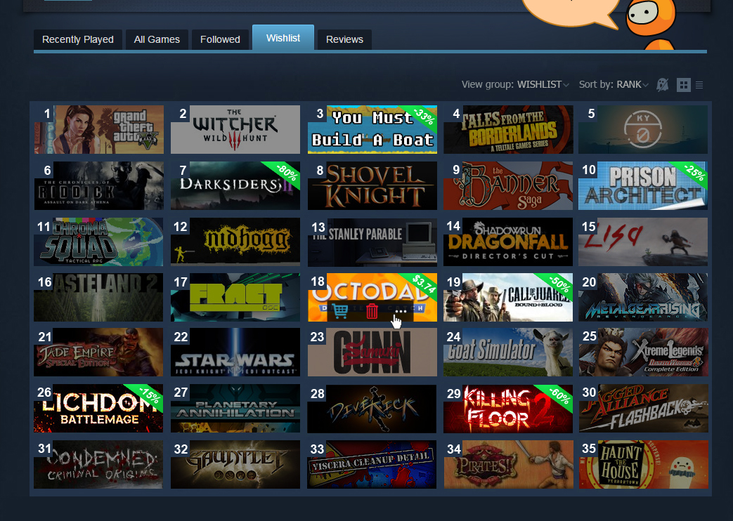
Hovering your mouse over a game will show you additional information such as its current price, a link to the store page, extra links to places such as the news page or community hub, and a handy trash icon that will instantly remove that game without the need to refresh the page. I understand that humans are flawed though and that sometimes we’re big dummies who delete stuff by accident so that’s why I’d include a quick confirmation button to make sure you definitely want that game out of your sight.
Since we’re on the subject of improving Steam, why the hell can’t I use my middle mouse button to open a Steam guide on a separate tab? Not even right clicking it allows you to do it. If you want to have multiple guides open you’re basically forced to have multiple tabs of the main guide page and then select the guide you want on each tab; either that or jump through some other hoops to do so. Point is, I shouldn’t have to go out of my way to open a page in a new tab. To me, technology exists to make life as efficient as possible and we should be constantly striving to push things forward, not backwards.
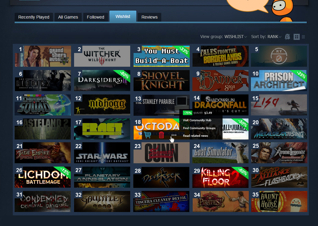
Clicking the “More Information” icon will open up an additional tab with more price information and additional links.
We might not get a complete overhaul of the Steam client for quite some time, but there’s absolutely no reason why the wishlist page should continue looking the way it does. With Valve slowly but surely improving Steam each year, leaving this antiquated design to roam wild not only messes with the user experience, but is a noticeable blemish that’s holding back a system that’s trying to move forward. My hopes with this article is that it gets the attention of whoever is in charge of designing Steam’s interface over at Valve and they take some of my points to heart. Well, that or they hire me as their chief hat tester; either way things work out pretty well for me.


Mon
February 7, 2017 at 7:16 am
Is this a mock-up or do you have Stylish/css code for us to implement this? Thanks!
Diego Escala
February 8, 2017 at 8:25 pm
Hey there, it’s just a mock-up and I’m hoping to make an updated version with a hopeful visual demo soon. Unfortunately I don’t really have enough programming knowledge to make a CSS code out of this, nor do I know if you’d even be able to drastically alter the wishlist menu at the level I discuss.