The genre of “base-building but evil” used to be much more of a thing. Between the Dungeon Keeper series and Evil Genius, the early 2000s were a happier time of roleplaying cartoonish evil before we knew the horrors of modern life. Whatever happened to Dungeon Keeper, anyway? …OH NO. Well, fortunately, Republic: The Revolution and Evil Genius did so well for Elixir that…OH NO. Oh, well, at least Kanye is still doing well, so not everything from 2004 is a total disaster. Moving on: Evil Genius 2 picks up that old IP and, unlike Dungeon Keeper, does not get exiled to the Island of IPs We Don’t Know What To Do With: mobile games. It’s a PC release on Steam so everything’s fine, right? Just like Kanye, he’s fine, right…?
Ha ha. Ahem. We’ll get there.
Evil Genius 2: World Domination
Developer: Rebellion
Price: $40
Platform: PC
MonsterVine was supplied with Steam code for review
For those of you who didn’t ride dinosaurs back in the 90s, Evil Genius 2 is evil base management, but you’re more Dr. Evil than Gaga Peron, which takes away some of the dissonance. You build a base (an evil base), hire workers (evil workers), send them out on missions (evil missions), and try to keep the whole (evil) operation running smoothly while dealing with enemy agents, the cops, and the fact that you are an evil genius and everyone else is a moron. I was roleplaying as myself the whole time.
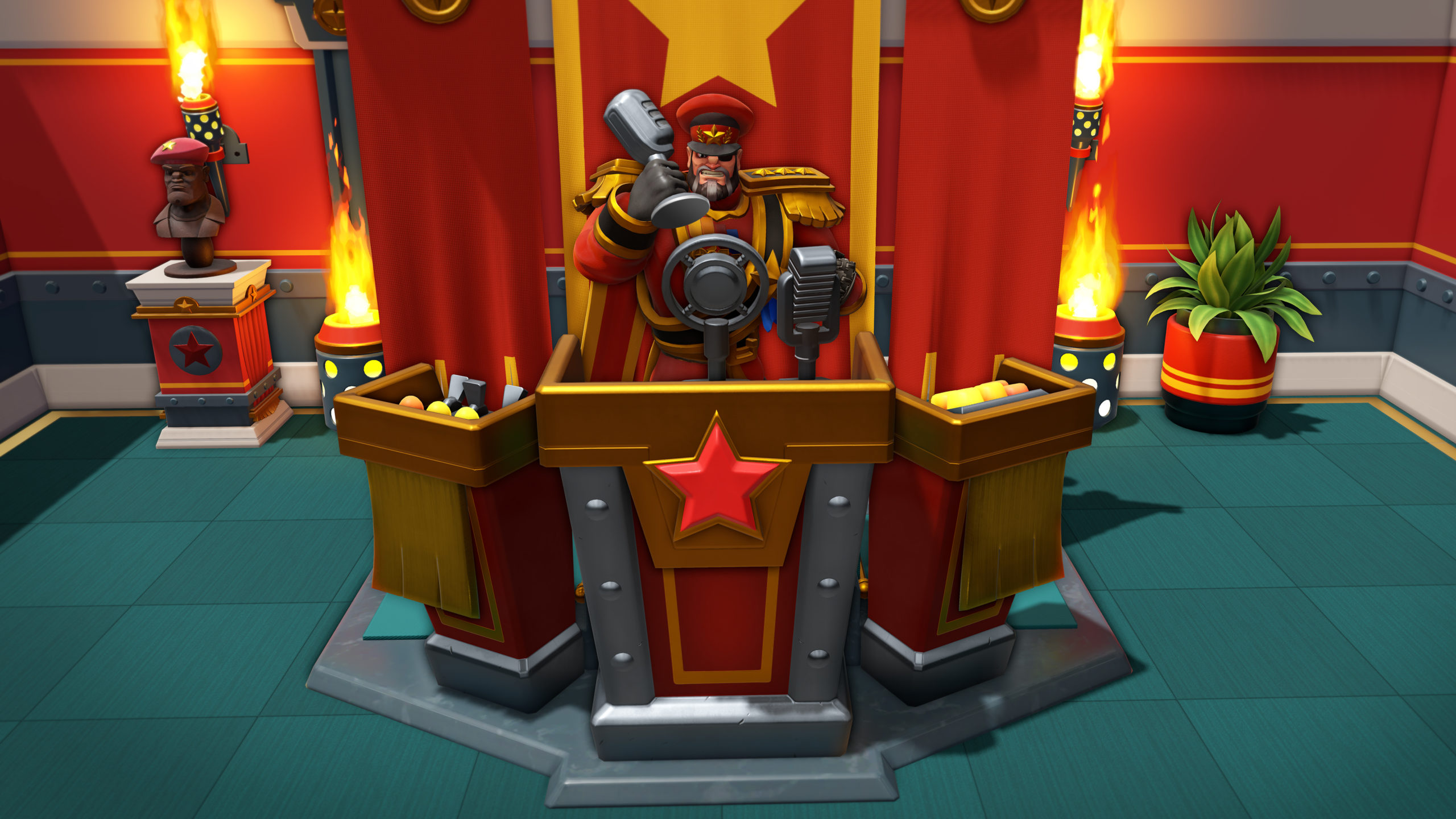
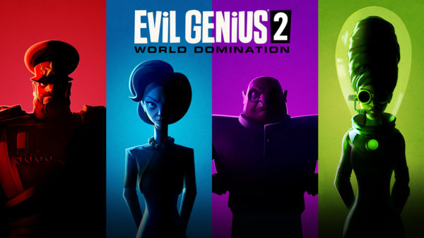
There are four Geniuses to choose from: Maximilian is basically cartoon Blofeld. Red Ivan is SOVIET RUSSIA. Zalika is the mad scientist. Emma works in PR. Which is fair. I used to work in PR and we are full of shit and evil. Each has their own power–Max commands more minions, Ivan is better at combat, Zalika better at research, Emma in reputation management–but the game is largely the same for each aside from that little bit of flavor. There are more to come in the (evil) DLC, I’m told.
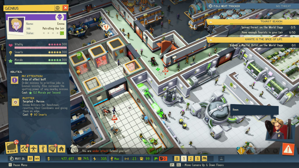
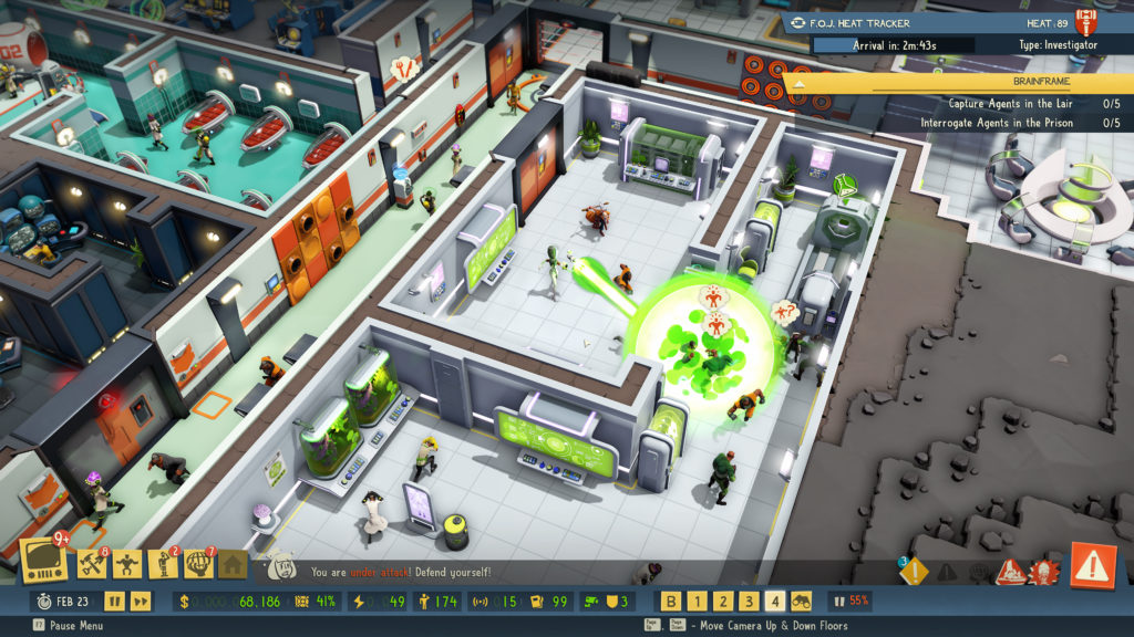
Now, despite my japes and goofs and shenanigans upfront, I don’t have a reflexive hate for mobile games like many PC gamers do. Unlike some losers, I have a phone. Sadly, the world of phone apps is seemingly where they’ve pulled their inspiration for interface design. Like the hackiest phone game, it puts EVERYTHING in your face with dozens of bouncing alerts and highlighted icons and quest updates and ALERT ALERT.
There are 10,000 alerts and reminders to click through and do something and none of them are all that important, except when they are. DO THIS says the tutorial. HEY, YOU HAVE A NEW QUEST says one of the windows. CLICK THESE 27 BUTTONS THERE’S NEW STUFF HERE YOU MAY OR MAY NOT CARE ABOUT. THERE’S AN EXCLAMATION MARK HERE BUT NONE OF THIS IS NEW BUT THERE’S STILL AN EXCLAMATION MARK MAYBE YOU FORGOT SOMETHING I DUNNO!
It’s like dealing with a golden retriever or toddler, where everything is EXCITING and DIFFERENT and NEW and chill the hell out kid, daddy needs a drink.
Ironically, the screen is incredibly cluttered, but very little of it is useful. For example, during the tutorial, I spaced on how to rotate something.
YOU CAN ROTATE ANYTHING the tutorial said
“Okay how”
YOU CAN EVEN ROTATE SOMETHING AFTER IT’S BEEN BUILT
“How”
DID YOU KNOW THE EARTH ROTATES
“Wot”
Okay no it didn’t say that one.
For a base building game, the building was painful. Sometimes it would SEEM like you could build something and it would even let you PLACE it but when you went to click CONFIRM, it wouldn’t let you actually build it. Why? I dunno!
Sometimes you also do a series of construction steps, but you have to CONFIRM them all. But! Sometimes you have done something illegal that it won’t let you do. So you wind up doing a bunch of stuff, then having to go back every step clicking UNDO and CONFIRM again, like they saw someone using “Undo” in Photoshop and went “But how can we gamify this thrilling loop?”
Some games do this “There are always ten things to do and time to do five of them” fairly well. In Bomber Command or FTL-style games, the ship is always exploding and that nerve-wracking part of gameplay is fun. In Evil Genius 2, there are always 10,000 things going on and most of them aren’t compelling or interesting. I remember getting an ALERT and a NEW MISSION and a NEW SIDE STORY and hollering “NOT NOW, I’M BUILDING A DOOR.”
Ah, yes, doors, my nemesis. For some reason, they are not in a menu of their own. Instead, you have to pick a room type, and then choose “Door” in that screen. I think. I could never get it to work otherwise. Then they are about five squares across but you really have to squint and rotate the map and figure out where it fits. THRILLING GAMEPLAY.
Which is the irony. Because building a complicated base full of traps to torture James Bond is fun, but getting all the doors to work and figuring out how to get your workers to do something turns you into Dr. Evil. There are parts of the game that are very fun and the visual soundtrack and style are very much on point. But someone took those parts and jammed them into a mobiNEW SIDE MISSION UNLOCKED NEW STORY MISSION UNLOCKED BUILD A GENERATOR YOU HAVE NO POWER AAAAAAAAAAAAAAAAAAAAAAAAA…
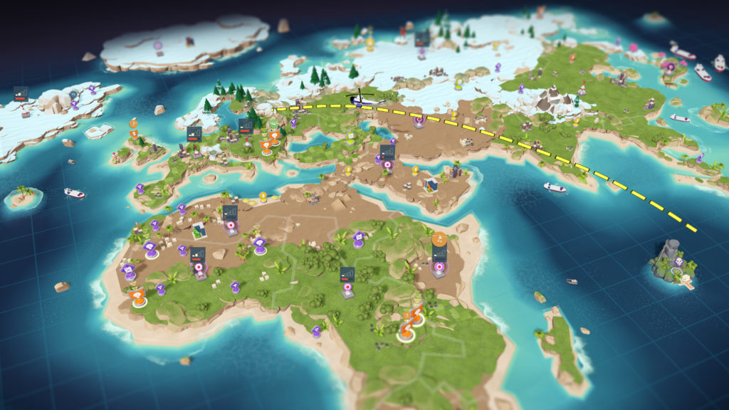
You toggle between the base map itself and the wider world map. I do understand the challenge: You want to keep the game fun and engaging while limiting the resources available to keep the player playing. Evil Genius 2 goes with a mobile game-style world map where you dispatch missions to steal money, blow things up, kidnap people, and do nefarious deeds. It’s not super interesting, but okay. But you still have to check in every few minutes to COLLECT MONEY or set up a new mission.
Your income comes from expanding your criminal network across regions, which is fine, but that’s yet another screen and map and dealing with the interface constantly demanding your attention. And it’s not especially interesting. It’s a map with different icons. You click one, read a flavor description, and decide if you want to do it. You click do it, and the timer starts. Check back in an hour or so. Love that thrilling gameplay. Again, you’ve encountered this if you’ve played pretty much any mobile game: gotta get those engagement numbers up up up!
And that’s another of the ironies: there are 10,000 things screaming for attention, but none of them are that interesting. Sometimes you’re sitting and waiting for a building to complete.
Likewise, there is a lot of sitting and waiting. This is incredibly unengaging early on when you’re beginning to build out your lair. Like, great, love sitting here literally not being able to do anything until you guys finish building.
You can see how they meant for it to work together: It’s clear that minion management could’ve been something interesting. Minions have stats and preferences. Your Genius has some buffs they can give out if they hang around, at the added risk of being caught if Good figures out where your base is. But there’s no real minion management for where to put a promising young worker. The game just assigns them to a task, so they have this neat information screen for…no reason that I can see.
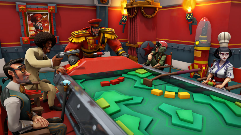
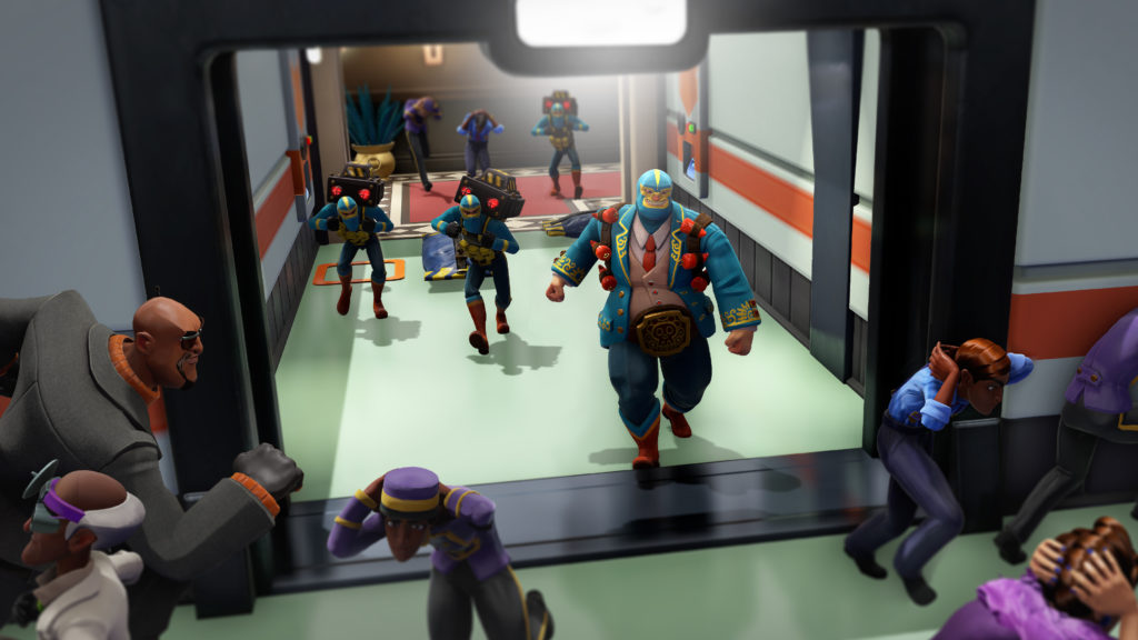
The antagonist, the fuzz, the cops, whatever you want to call them, will eventually come calling. What is a game of being an Evil Genius without a good guy to torment with your traps and tortures? There is a genuine joy when a Super Agent stumbles into your base and bounces through your expertly arranged traps only to wind up imprisoned and tortured. That is when you truly feel like an evil genius.
Sandbox mode is where the game really shines since you have more resources and can focus on crafting the ideal Evil Lair rather than phone game-style resource management. There’s a good core but the rest of the game is the Diet Coke of Evil: Just one calorie, not evil enough.
 The Final Word
Some fun to be had if you can get past the 100 mobile-style alerts telling you something is going on NOW NOW NOW IT’S IMPORTANT PAY ATTENTION TO ME LOVE ME NEW STORY UNLOCKED AAAAAAAA
– MonsterVine Rating: 3 out of 5 – Average

