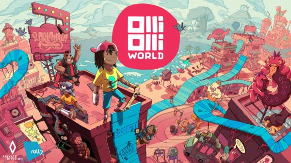
We’re only a few weeks away from the release of OlliOlli World and I got the chance to check out a second preview build of the game.
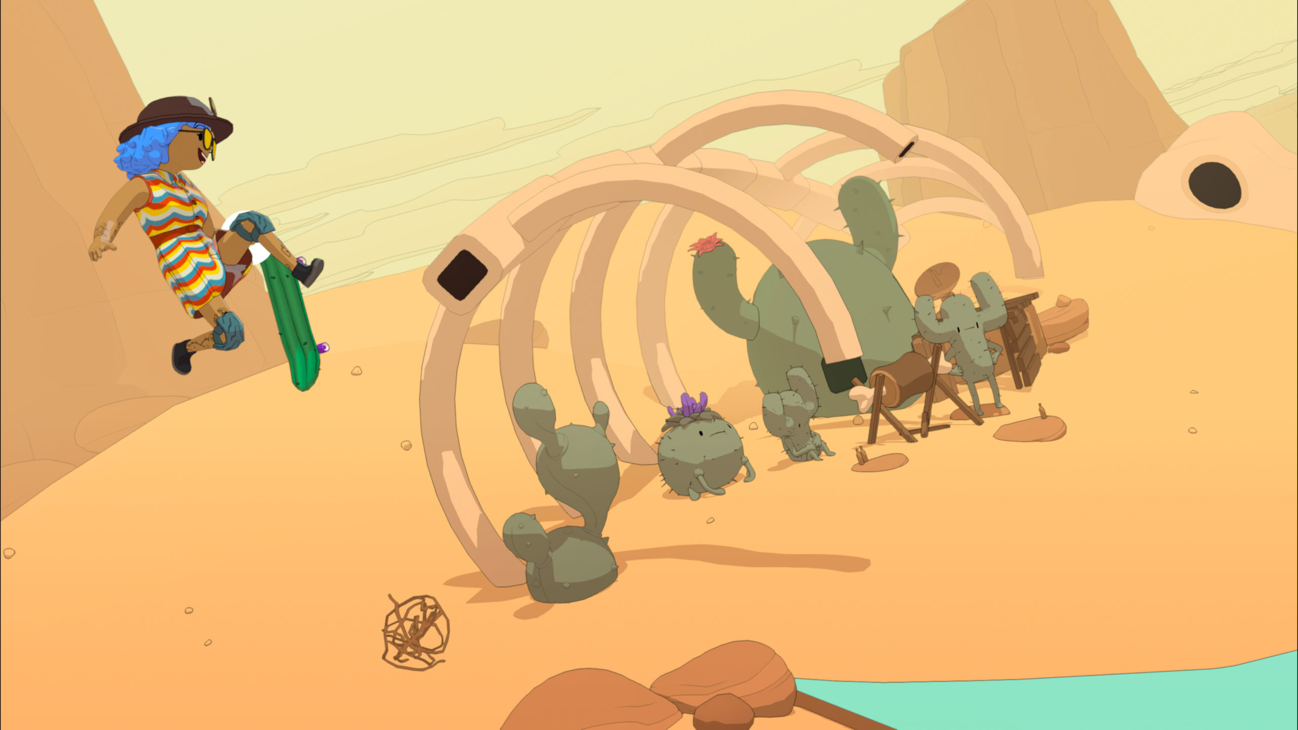
In case you’ve been out of the loop, OlliOlli is a side scrolling skateboarding game from Roll7, and OlliOlli World is not only the third entry in the series, but its first foray into a 3D aesthetic. You can read my impressions of the first build here, but new to this second build is the addition of two other zones to skate in, along with the customization menu. Whereas the first world was a fun, California beach styled area, the second is a forest teaming with oversized critters and the third features aliens in a desert. The pastel art style continues to be an absolute treat to look at, and the music is a great selection of lo-fi tracks.
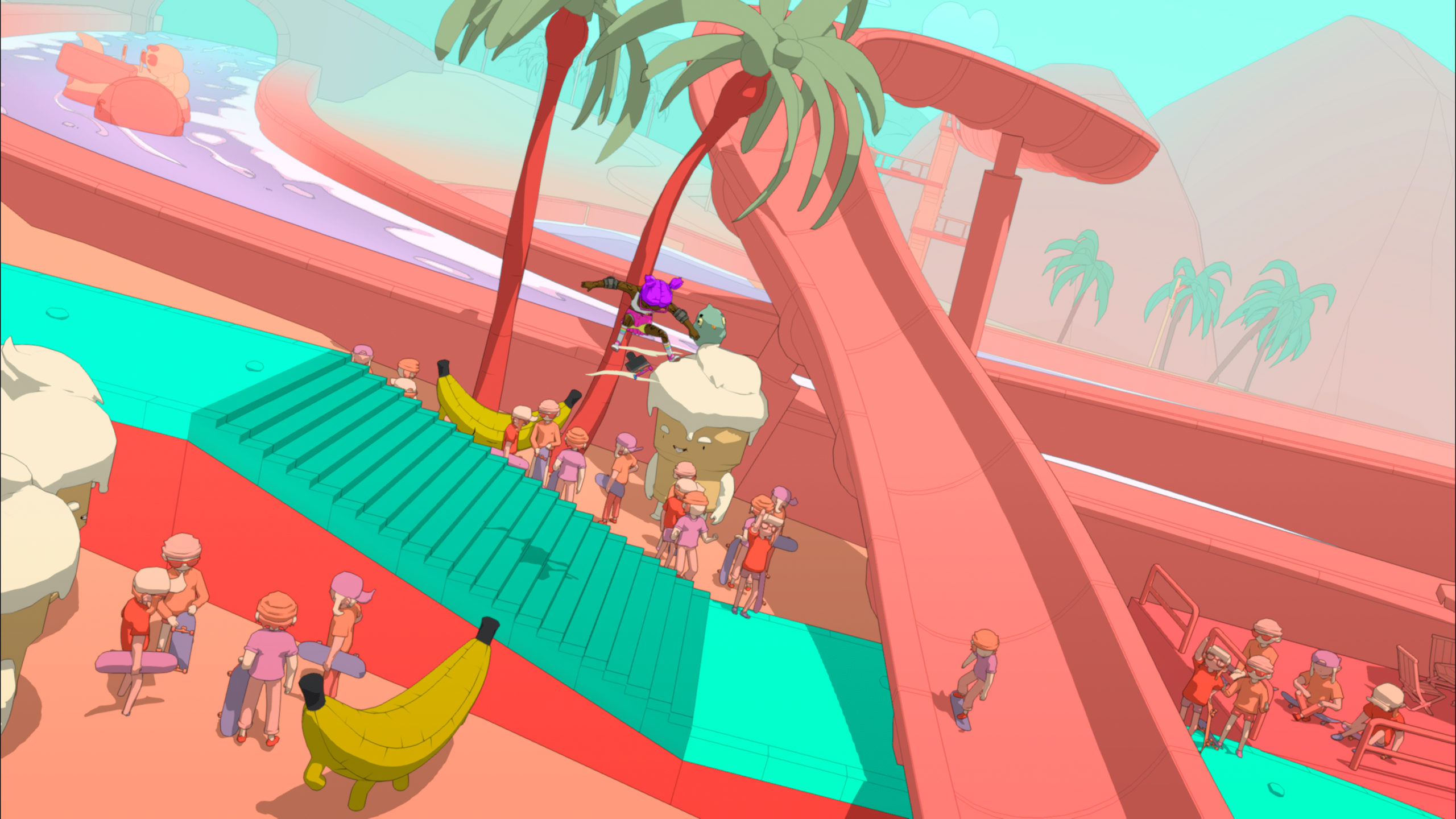
Playing the game is very simple, as flicking your analog sticks in specific directions will control your tricks as your character moves forward on their own. This frees you up to focus on what environmental obstacles are coming your way and how to best react to them. I appreciated how all skate tricks are available to you from the start, but the game does a good job of narratively introducing them to you at a steady pace, with levels themed around that particular trick to give you time to master it before moving you onto the next trick type. OlliOlli is a deceptively challenging game, as the beginning feels like a chill skating game. The further you progress, the more the game will require you to know how to string trick combos together in fast paced levels. Getting through a particularly challenging level, all while keeping a combo going, is a thrilling experience that can leave you breathless at times.
Multiple paths continue to be my favorite change to the OlliOlli formula. If you haven’t kept up, Roll7 has shifted the linearity of the first two games into a semi-nonlinear experience by allowing you to take different paths in a level. The default path you’re on will always be the easiest of the two, but if you feel like challenging yourself you can take the optional path when it comes up (sometimes multiple times per level). The addition of this puts a bit of control in your experience, as if you feel you need a bit of a breather you can stick to the easier path. It also helps encourage replayability as some challenges or side quests can only be found on certain paths.
This build allowed me to try out the game’s robust customization. You can edit the features of your skater, their clothes (with a huge variety of in-game brands to choose from), your board, and even some of your character’s animations. There’s a surprising amount to play with in here and can’t wait to see what silly skaters people dress up.
I also got a small taste of the new “Gnarvana” game mode. It’s split into two variations: a “league” mode where you’ll compete on the same track as everyone and try to nail the highest score possible while the level is active, and a level generator. The Gnarvana Portal is really neat as you can customize the setting, difficulty, and length of a level which will generate a seed code for you to share if you come up with anything neat. Neither mode allowed me to fully explore considering I’m in a preview window, but it’ll be interesting to see both play out on release when players flood the game.
My one nitpick with the game is that it’s not as quick to jump into a level as it used to be. Before, you’d just select the level and go. When you’re done you go back to the map and pick the next. Here, you have to mash the button to skip through narrative drivel (assuming you didn’t hit the skip) and when the level ends you have more conversations to mash through. It wouldn’t be as much of an annoyance if it were interesting, instead it’s always just your friends talking about how much they love skating which gets old quick and feels like a speedbump (minor as it is) from you jumping straight into the next level. I wish you could also preview a level’s challenges and rewards. As it currently is you need to load into a level (dealing with the intro conversation too) to view that stuff, and I just wish I could see it from the map screen to save me time to decide if I want to tackle it or not. These are just nitpicks of course, but they come up often enough it starts to become a noticeable annoyance on what’s otherwise a phenomenal experience.
My second preview of OlliOlli World continues to impress, and I can’t wait to see more.


